ShopDreamUp AI ArtDreamUp

Deviation Actions


Suggested Deviants


Suggested Collections


You Might Like…


Description
edit- updated the text with a more manga style font
page 2
page 3- [link]
I want to do sumthing a little different this round.
if sum things in Riot's dialog dont make the most sense.
Remember; Im doing that on purpose and bare in mind that Riot is Literally insane.
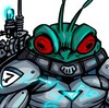
the cameo is Cptn. Edison. another VIRUS captain
page 2
page 3- [link]
I want to do sumthing a little different this round.
if sum things in Riot's dialog dont make the most sense.
Remember; Im doing that on purpose and bare in mind that Riot is Literally insane.
the cameo is Cptn. Edison. another VIRUS captain
Image size
2517x3283px 4.15 MB
© 2010 - 2024 callme-Nobodi
Comments8
Join the community to add your comment. Already a deviant? Log In
A lot of the time, centre justify works best in circular dialog box situations. An even spacing of empty space between the bubble line and the text looks much cleaner.
And the dialogue would definitely benefit from some stricter grammar. Capitalisation at the start of a sentence, commas, and all that. Anything written in nothing but lower case looks messy. Also, your font feels a little archaic, typewritery, and out of place - a softer, rounder font would work better. To solve both of these problems, you could be a conformist and use a popular comic / manga font: [link] . It's all caps by default, and that always looks neater than lower case. Other fonts are listed here, along with a trillion tips that could be helpful: [link] . If I find the one that they use for crazy yelling and shit, I'll let you know.
It'd be great if you addressed these issues. They're the only thing dragging down an otherwise excellent comic, and the text is the easiest thing to edit, hands down.
At the very least, give it a try, and see if you consider it an improvement.